Summary
The fastest way to compare peptide vendors is to compare what you can verify. Branding matters less when the real signals are easy to stack side by side.
Section 1
Start with the signals you can verify
Key takeaway
A lot of vendor comparisons go wrong because buyers start with the loudest promise instead of the cleanest evidence. A better approach is to compare the few trust signals that can actually be checked across multiple sites in the same sitting.
That means documentation, product-page clarity, storage guidance, support pages, and overall tone. These are not the only variables that matter, but they are some of the easiest to compare without getting dragged into hype.
Section 2
Compare documentation before branding
Key takeaway
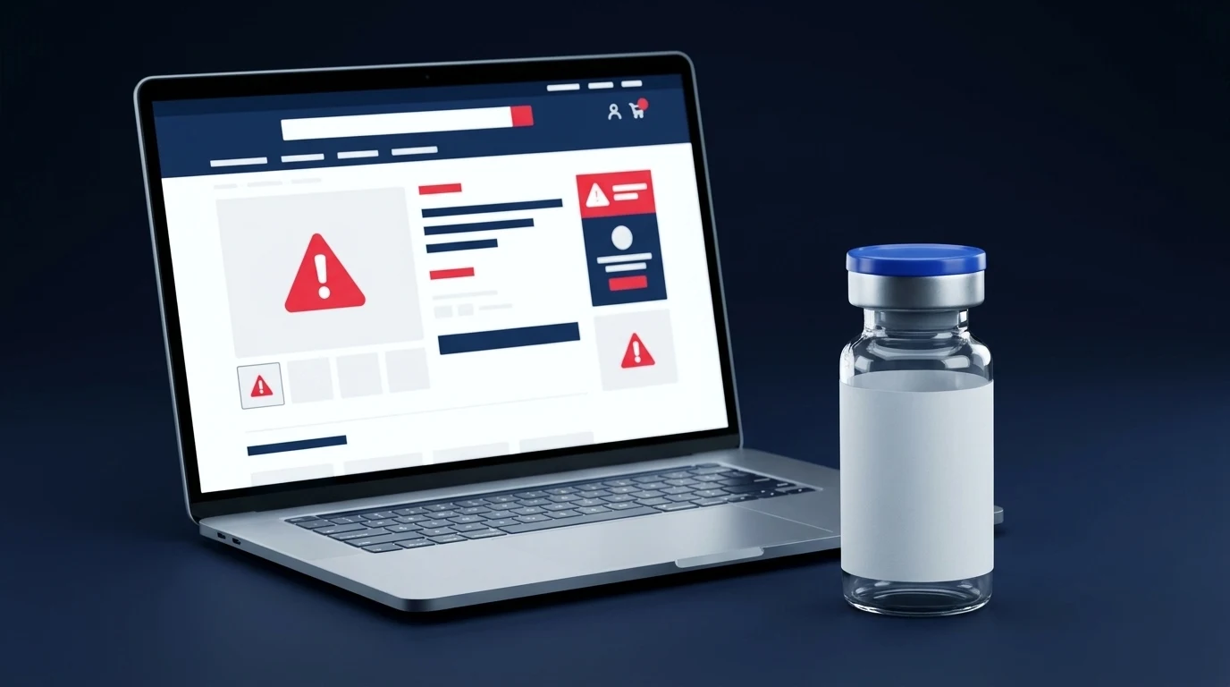
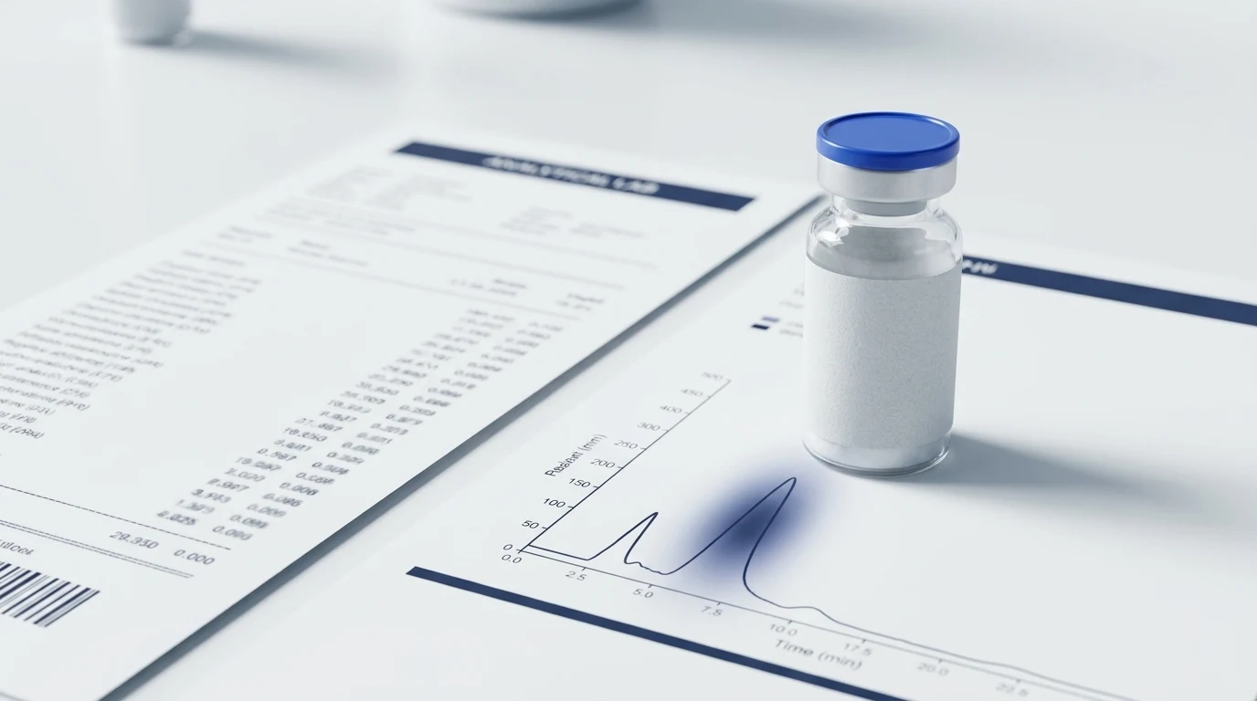
The first thing to compare is how each site handles proof. Does the vendor make batch or analytical context easy to reach, or do they just gesture at quality with broad claims and premium design language?
The cleaner vendor is usually the one that makes verification faster. If branding is strong but the documentation path is weak, the brand is doing more work than the evidence.
Section 3
Compare product-page clarity before pricing
Key takeaway
Price matters, but product-page clarity should come first. If one site makes the compound, quantity, format, and storage basics obvious while another hides the same information behind tabs and filler, that difference matters before the first discount badge ever enters the picture.
Cheap confusion is not a value. A clear listing saves time and reduces the chance that the buyer is making assumptions where the site should be providing answers.
- Can you identify quantity and format instantly?
- Is purity shown with any useful context?
- Can you reach support pages without friction?
Section 4
Compare support and policy pages before checkout
Key takeaway
The FAQ, refund, shipping, and research-disclaimer pages tell you a lot about how a site behaves once the main product card is out of the spotlight. Strong vendors build trust across these surrounding pages instead of treating them as an afterthought.
Weak vendors often do the opposite. The product page looks expensive, but the support path feels thin, generic, or incomplete once you click away from the hero section.
Section 5
Compare tone, claims, and pressure tactics
Key takeaway
Tone is a quality signal because it shows what the seller thinks will move the buyer. FDA warning letters to peptide and related sellers repeatedly show how quickly aggressive claims can become a real problem once product pages drift into treatment language or unsupported certainty.
A restrained site is usually easier to trust than one that tries to close the sale with disease language, guaranteed-outcome energy, or constant urgency. Calm pages often communicate more confidence than loud ones, which is one reason the red flags on a product page are worth learning early.
Section 6
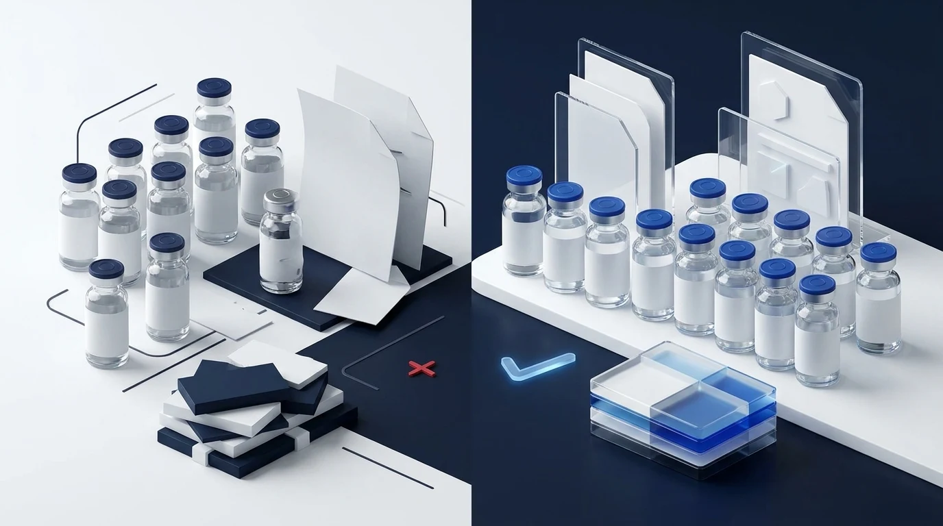
Use a simple vendor scorecard
Key takeaway
The easiest way to compare vendors without drifting into vibe-based decisions is to score each one on the same short list. That keeps the comparison grounded even when the sites have different aesthetics or product assortments.
If one vendor wins on proof, clarity, and support while another wins only on presentation, the decision gets easier fast.
- Documentation path
- Product-page clarity
- Storage and handling guidance
- Support and policy quality
- Tone and claim restraint
Section 7
A cleaner way to judge the category
Key takeaway
You do not need a perfect vendor to make a smarter decision. You just need a comparison method that rewards verifiable information instead of polished pressure.
Stack the pages side by side, compare the same signals each time, and let the quiet details beat the loudest claims.